How to Improve a Small Business Website Contact Form
A practical guide to making your website contact form easier to complete, more trustworthy and more useful to your business. Focus on the fields you need, the wording you use, mobile usability, technical checks and how to track whether the form is doing its job.
By Henry Clarke · Published 8 October 2026 · Updated 8 October 2026 · 13 min read
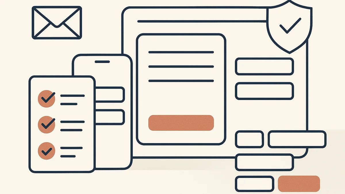
Your contact form is often the last step before a prospect speaks to you. If it feels awkward, unclear or unreliable, people will stop there and choose another business. If it is straightforward, they are more likely to finish the form and start a conversation.
For many small businesses, the contact form does more than collect messages. It may handle quote requests, callback requests, bookings, support queries or sales enquiries. That means the form needs a clear job, sensible wording and a layout that works on a phone as well as a laptop.
Key takeaways
- Start with the form’s job: enquiry, quote, booking, callback or support.
- Remove any field that does not help you respond better.
- Use labels and helper text that explain what to enter and what happens next.
- Make the form easy to complete on mobile, with short fields and obvious buttons.
- Build trust near the form with privacy wording, response times and contact alternatives.
- Check the technical basics: validation, delivery, thank-you page and spam protection.
- Track submissions and completion rate, then test small changes one at a time.
Why the contact form matters
The contact form is usually where a visitor decides whether your business feels easy to deal with. At that point, they already know roughly what you do. What they still need to know is whether contacting you will be simple, safe and worth the effort.
That is why the form should not be treated as a generic page element. It is part of your sales process, your customer service process or both. If you ask for too much too soon, people may leave. If you ask too little, you may receive enquiries that are hard to action.
The real job depends on your business
Before changing fields or redesigning the page, decide what the form is for. A good form only has one main job, even if it serves several related needs.
- Enquiries: A general message from a prospect who wants to make contact.
- Quotes: A request for pricing or a rough estimate.
- Callbacks: A request for you to phone the customer back.
- Bookings: A request to reserve a time or place.
- Support: A request for help with an existing order or account.
If one form tries to do all five jobs at once, it usually becomes longer and less clear. In that case, you may need separate forms or a simple first question that routes the visitor to the right path.
What usually goes wrong
Most weak contact forms fail for familiar reasons. The issues are rarely dramatic, but they add friction at the moment people are deciding whether to continue.
- Too many fields: You ask for more than you need before contact is established.
- Weak wording: Labels do not explain what to enter or why the information matters.
- Poor mobile layout: The form is hard to read, tap or complete on a small screen.
- No response expectation: People do not know when or how you will reply.
- Technical errors: Messages are not delivered, errors are not clear, or spam gets through.
None of these problems needs a major redesign to fix. In most cases, the best improvement is to remove friction step by step and make each part of the form easier to understand.
Start with the job of the form
Ask what you want the form to do for the business, then shape it around that outcome. The more specific the job, the easier it is to choose fields and wording.
If the form is for enquiries
Keep it short and open. People usually want to send a message, not fill in a questionnaire. Name, email, message and perhaps one optional phone number may be enough.
If the form is for quotes
You may need more context, but not every detail. Focus on the facts you need to judge the job: service type, location, timing, budget range or project size, depending on your business.
If the form is for bookings
Make it clear what can be booked and what happens after submission. If the booking is not confirmed instantly, say so plainly.
If the form is for support
Use the form to collect the details your team needs to help quickly: order number, account email, issue type and a brief description. A support form is one of the few cases where slightly more structure is usually helpful.
Decide which fields are essential
A useful form asks for the minimum information needed to handle the enquiry properly. Anything beyond that should earn its place.
Typical essential fields
- Name
- Email address
- Phone number, if you genuinely use it
- Message or enquiry details
Fields to question carefully
- Company name
- Postcode or address
- Budget
- Preferred contact method
- How they found you
- Project deadline
These can be useful, but only if you will actually use the information. If a field does not change how you respond, it may be unnecessary.
Practical rule: if you would not ask for a piece of information in a first phone call, think carefully before making it mandatory on the form.
Optional is often better than required
Some questions can stay on the form if they are truly helpful, but marked as optional. That lets cautious users move forward without feeling blocked, while still giving you extra detail from people willing to provide it.
Write labels and helper text that reduce hesitation
Good form writing does two things: it tells people what to do, and it removes small doubts before they become abandonment.
Use clear labels
Labels should be plain and specific. “Your message” is better than a vague prompt such as “Tell us more”. “Phone number” is clearer than “Contact details”. If you want a particular format, say so.
Use helper text where it matters
Helper text is the short line beneath a field that explains how to complete it. Use it to cut uncertainty, not to clutter the page.
- Example: “Include the best number to reach you on weekdays.”
- Example: “Tell us the type of service you need and any important deadlines.”
- Example: “We usually reply by email. If you prefer a phone call, add your number.”
Explain what happens next
People often hesitate because they do not know what submitting the form means in practice. Say whether they will get an automatic confirmation, when they can expect a reply and whether someone may call them back.
If your response time varies by day or by service type, keep the wording honest and simple. A vague promise is less helpful than a realistic one.
Make the form easy to use on mobile
Many visitors will view your site on a phone, so the form needs to work cleanly on a smaller screen. A desktop-friendly form can still fail on mobile if fields are cramped or buttons are awkward to tap.
Mobile-friendly form design
- Keep each field short where possible.
- Use the right keyboard type for email, phone and number fields.
- Leave enough spacing between fields and buttons.
- Make the submit button large and easy to identify.
- Avoid forcing users to zoom or scroll sideways.
If your form contains several long fields, ask whether some can be removed, moved to a later step or replaced with a simpler choice.
Button text should be obvious
“Submit” works, but it is not especially helpful. More specific wording often reduces hesitation because it tells people what they are about to do.
- Send enquiry
- Request a quote
- Book a callback
- Contact support
Choose wording that matches the page and the action. The button should feel like the next step, not a generic form control.
Reduce friction without losing useful context
You do not have to choose between a bare-bones form and an overcomplicated one. The aim is to keep the form fast to complete while still collecting the information that helps you reply well.
When to use dropdowns
Dropdowns work best when you are asking someone to choose from a small set of known options. They can reduce typing and standardise answers, which makes the responses easier to sort.
- Type of service needed
- Location
- Preferred appointment slot
- Reason for contacting support
Do not use a dropdown if the list is long, unclear or likely to frustrate people who already know their answer.
When to use checkboxes
Checkboxes are useful when people may choose more than one option. That makes them a good fit for support topics, service interests or consent choices where multiple selections are allowed.
When free text is better
Free text is better when you need context, nuance or unusual details. Project briefs, problem descriptions and special requirements are often best left open rather than constrained by fixed options.
A common mistake is to replace one broad message box with several tiny compulsory fields. That can make the form feel more demanding without improving the quality of the enquiry.
Build trust near the form
When visitors are close to sending a message, they look for reassurance. Small cues near the form can reduce anxiety and make it easier to proceed.
Useful trust signals
- Privacy wording that explains how you will use the information.
- A realistic response time, such as “We aim to reply within one working day”.
- Alternative contact options, such as email or phone, if they prefer not to use the form.
- Reassurance that you do not pass details to third parties without reason.
- A short note if you only handle enquiries during business hours.
For small organisations, the Information Commissioner's Office has guidance aimed at small and medium-sized organisations, start-ups, sole traders, small charities, groups and clubs: https://ico.org.uk/for-organisations/advice-for-small-organisations/. In practical terms, that means you should think carefully about how you collect and use personal data on the form, and keep your wording straightforward.
Make spam protection unobtrusive
Spam protection is useful, but it should not create more friction than the spam it prevents. If a protection step is visible to users, make sure it is easy to understand and does not block genuine enquiries unnecessarily.
Check the technical basics
A polished-looking form can still fail if the underlying setup is unreliable. Before you launch changes, check the technical path from submission to inbox.
Validation
Validation checks whether a field contains a valid entry. For example, it can stop obvious email mistakes or missing required fields before the form is submitted. Keep validation helpful and specific. Users should know exactly what needs correcting.
Error messages
Error messages should point to the problem in plain English. Avoid generic warnings that force people to hunt for the issue. If a field is wrong, say which one and what to enter instead.
Thank-you page or confirmation message
After submission, people should see a clear confirmation. A thank-you page is often better than a tiny inline message because it gives you room to explain what happens next and what to do if the message was urgent.
Email delivery
Test whether form submissions reliably reach the correct inbox. This sounds basic, but it is one of the most common operational failures. Check that the right people receive the message and that replies are set up sensibly.
Spam protection
Use sensible protection against automated submissions, but keep genuine users in mind. If you rely on a challenge that is difficult on mobile or for accessibility reasons, you may lose real leads as well as spam.
Track whether the form is working
Once the form is live, do not judge it only by the number of submissions. A high volume of poor-quality leads can be a sign that the form is too loose. A low volume may mean the form is too hard to complete or not visible enough.
Useful measures to review
- Submissions: How many people complete the form?
- Completion rate: How many start versus finish?
- Lead quality: Are the messages relevant and useful?
- Missed enquiries: Are people contacting you by other routes because the form is frustrating?
These measures help you decide whether the problem is the form itself, the page it sits on or the wider enquiry process. If the form gets few submissions but strong phone enquiries, the issue may be placement or visibility rather than wording alone.
Test and improve in small steps
Do not redesign everything at once. Small, controlled changes are easier to judge and less likely to create new problems.
Good things to test one at a time
- Field order
- Which fields are required
- Button text
- Shorter helper text
- Form placement on key pages
If you change several things together, you will not know which one helped. A simple before-and-after approach is often enough for a small business.
Test the form where people actually use it
Check the form on the pages that matter most, such as your homepage, service pages and contact page. A form can perform differently depending on the page context. Visitors who arrive on a service page may want a quote, while homepage visitors may simply want a quick way to get in touch.
Examples of simple form structures
These examples show how a contact form can match the business without becoming complicated. Use them as starting points, not as fixed templates.
Service business: quote request
- Name
- Phone number, optional
- Type of service needed
- Brief description of the job
- Preferred timing
This structure works well when you need enough detail to assess the job, but not a full project brief before first contact.
Local business: callback or visit enquiry
- Name
- Email or phone number
- Reason for contact
- Best time to reach you, optional
- Message
This suits businesses where speed and convenience matter more than collecting every detail upfront.
Ecommerce support page
- Name
- Email used for the order
- Order number
- Issue type
- Message
This setup helps support teams identify the order quickly and route the request to the right person.
Review the form before you launch changes
Before publishing a revised form, work through a final check. This helps you catch obvious issues and prevents avoidable drop-off after launch.
Practical improvement checklist
- Does the form have one clear job?
- Are all required fields genuinely necessary?
- Do labels explain what to enter?
- Does helper text reduce hesitation?
- Is the form comfortable to use on mobile?
- Does the button text match the action?
- Are response times and next steps clear?
- Do you offer another contact route?
- Have you tested validation and error messages?
- Do submissions reach the right inbox?
- Does the thank-you page confirm what happens next?
- Are you protecting against spam without blocking genuine users?
If you want a wider review of your site before making changes, it can help to compare the form against the rest of your site structure and user journey. Our small business website planning checklist is a useful place to cross-check the role of your contact page, service pages and calls to action.
The best contact form is usually the one that makes it easiest for the right person to reach you with the right information. Keep it short where you can, clear where you must, and reliable every time someone presses send.
Frequently asked questions
How many fields should a small business contact form have?
There is no fixed number. The right number is the smallest set of fields needed to handle the enquiry properly. For a general enquiry form, that may be just name, email and message. For a quote or support form, you may need a few more details.
Should I always ask for a phone number?
Only if you will genuinely use it. Some people prefer email, and a phone field can feel more intrusive than helpful. If you want the option to call back, make the field optional or explain why it helps.
What is the most common mistake on contact forms?
Asking for too much too soon is one of the most common problems. Another is failing to say what happens after submission, which leaves people unsure whether their message has been received.
Should I use a contact form or just publish an email address?
A form can help you collect cleaner enquiries and reduce spam, while an email address offers a simple alternative for people who prefer it. Many businesses do both, as long as the contact options are easy to find and managed properly.
Related articles

Small business website planning checklist: a practical UK guide
A practical checklist for planning a small business website in the UK, covering goals, pages, content, user journeys, accessibility, compliance, search basics and launch checks.
3 October 2026 · 10 min read